| Metric | Population-weighted average in split neighborhoods | Population-weighted average in non-split neighborhoods | Population-weighted difference |
|---|---|---|---|
| Black Share | 25.2% | 27.9% | -2.7% |
| Hispanic Share | 34.0% | 28.1% | 5.9% |
| Nonwhite Share | 68.9% | 67.2% | 1.7% |
| Median Household Income | $91,161 | $84,367 | $6,794 |
| Poverty Rate | 16.9% | 16.5% | 0.4% |
| Bachelor’s Degree or Higher | 43.5% | 41.7% | 1.7% |
| Unemployment Rate | 8.2% | 8.8% | -0.6% |
| Population | 69,379 | 43,843 | 25,537 |
Which Chicago Neighborhoods Are Split Across Wards?
Mapping Chicago community areas where representation is divided across multiple wards
Summary
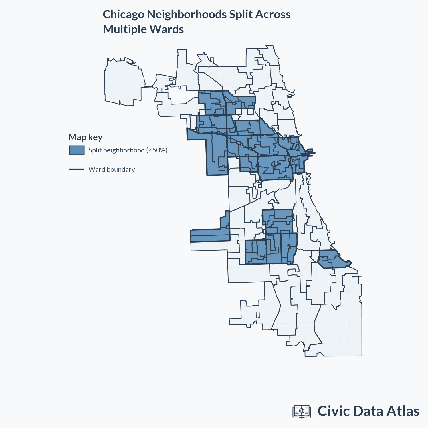
- Eighteen of Chicago’s 77 neighborhoods are split across multiple City Council wards.
- More than a third of Chicago residents live in a neighborhood where no single ward represents a majority of residents.
- After controlling for population size, split neighborhoods have lower incomes, higher poverty rates, and larger Black and Hispanic population shares than non-split neighborhoods.
Chicago’s Englewood neighborhood is widely known for being split across six different City Council wards. Without one elected representative to advocate on behalf of the entire community, many residents argue that Englewood’s needs are shortchanged by the city.
While Englewood’s situation is particularly notable, it is not the only Chicago neighborhood split across multiple wards. The map below overlays Chicago’s ward boundaries with neighborhoods in which no single ward represents more than 50% of residents.1 In total, eighteen Chicago neighborhoods are split this way, accounting for more than a third of the city’s population. These splits are concentrated around a handful of South Side neighborhoods, as well as downtown and the Northwest Side corridor.
Characteristics of Neighborhoods Split Across Multiple Wards
Englewood has historically been one of Chicago’s poorest predominantly Black neighborhoods. Are other neighborhoods split across multiple wards also lower-income than neighborhoods with more unified ward representation? At first glance, the answer appears to be no. Split neighborhoods have median household incomes and racial demographics that look very similar to those of non-split neighborhoods.
However, one striking difference between split and non-split neighborhoods is their population size. Split neighborhoods are much larger, and larger neighborhoods are harder to fit within a single ward.
To make a more apples-to-apples comparison, the second table controls for neighborhood population size. In other words, it compares split and non-split neighborhoods of the same population size. Once we make that adjustment, split neighborhoods have larger Black and Hispanic population shares than non-split neighborhoods. They also have lower incomes, as well as higher poverty and unemployment rates.
When higher-income, predominantly white neighborhoods are split across wards, it is generally because they are very large, which makes them difficult to fit within a single ward. By contrast, lower-income, predominantly Black or Hispanic split neighborhoods are not especially large; alternative ward boundaries would not necessarily struggle to keep these neighborhoods mostly represented by one alderperson.
| Metric | Average in split neighborhoods, controlling for neighborhood population size | Average in non-split neighborhoods, controlling for neighborhood population size | Difference, controlling for neighborhood population size |
|---|---|---|---|
| Black Share | 42.4% | 33.0% | 9.3% |
| Hispanic Share | 32.7% | 27.1% | 5.5% |
| Nonwhite Share | 82.4% | 70.9% | 11.5% |
| Median Household Income | $72,963 | $81,483 | -$8,520 |
| Poverty Rate | 22.9% | 17.4% | 5.5% |
| Bachelor’s Degree or Higher | 31.2% | 38.7% | -7.5% |
| Unemployment Rate | 11.7% | 9.6% | 2.1% |
Neighborhoods Where No Ward Holds a Majority
| Neighborhood | Population | Ward shares of neighborhood population |
|---|---|---|
| Austin | 123,151 | 29 (46%); 37 (41%); 28 (11%); 24 (1%) |
| Belmont Cragin | 72,088 | 31 (41%); 36 (25%); 30 (24%); 26 (10%) |
| Chicago Lawn | 54,409 | 16 (31%); 14 (22%); 15 (20%); 18 (13%); 17 (12%); 23 (1%) |
| East Garfield Park | 20,731 | 28 (50%); 27 (27%); 24 (23%) |
| Englewood | 23,195 | 16 (48%); 6 (26%); 20 (14%); 17 (12%) |
| Garfield Ridge | 45,158 | 23 (49%); 13 (31%); 22 (18%); 14 (3%) |
| Hermosa | 22,576 | 31 (45%); 26 (30%); 35 (26%) |
| Humboldt Park | 56,138 | 26 (40%); 37 (25%); 27 (23%); 36 (12%) |
| Irving Park | 53,332 | 33 (42%); 30 (23%); 39 (18%); 35 (10%); 45 (7%) |
| Logan Square | 71,207 | 35 (37%); 1 (31%); 32 (19%); 26 (14%) |
| Loop | 42,550 | 34 (40%); 42 (34%); 4 (27%) |
| Near North Side | 107,331 | 2 (47%); 42 (37%); 27 (11%); 43 (5%) |
| Near West Side | 68,165 | 34 (47%); 28 (24%); 27 (23%); 25 (6%) |
| New City (Back of the Yards) | 40,065 | 15 (45%); 20 (27%); 16 (22%); 11 (5%); 12 (1%) |
| Portage Park | 63,094 | 38 (32%); 30 (28%); 45 (27%); 31 (12%); 41 (2%) |
| South Shore | 53,588 | 7 (46%); 5 (37%); 8 (17%) |
| West Englewood | 28,144 | 16 (45%); 17 (36%); 15 (19%) |
| West Town | 88,164 | 1 (40%); 36 (25%); 27 (13%); 26 (13%); 32 (8%) |
Footnotes
To map neighborhoods, we use Chicago’s canonical 77 community areas.↩︎